Acerca de
Acerca de
Qualia Wellness App
Tuli
Creating a voice system for low vision tourists visiting Amsterdam to enhance their experience through lowering the time spent planning and allowing for customization to meet traveler needs.

OVERVIEW
Duration
January - March 2021 (class project)
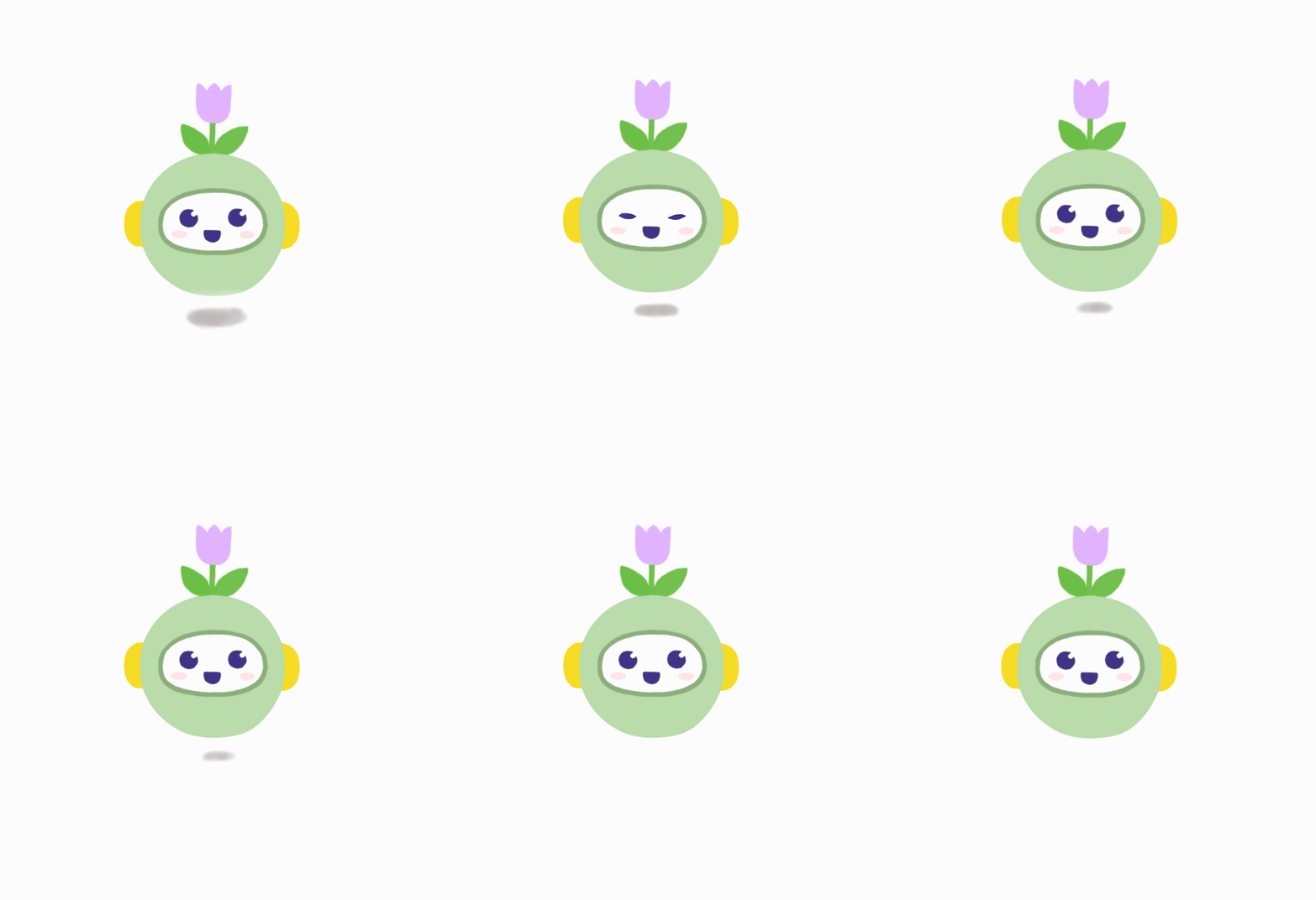
Tuli is a voice assistant designed to be accessible and easy to use by low vision tourists, an often overlooked demographic. This personalized and innovative system helps users find information on conveniently located transportation options, local points of interest, food and drink options, and restrooms. Custom itinerary planning and the ability to instantly share experiences with others are also included to enhance the traveler’s experience.
My Role
VUI Designer
Key Skills
VUI design, UX design, accessible design, information architecture, surveying, user flows, voice branding
Tools
Canva, Figma, Google Sheets, Miro, Voiceflow
DESIGN QUESTION
How might we design a voice system that can accommodate a low vision tourist in Amsterdam using a phone?
RESEARCH
Secondary Research
Due to time constraints and limited access to low vision users (especially during the pandemic), most of the research my team of 4 did was secondary. We began by finding a definition for what exactly “low vision” means:
Low vision is a condition caused by eye disease, in which visual acuity is 20/70 or poorer in the better-seeing eye and cannot be corrected or improved with regular eyeglasses.
~ American Federation of the Blind

We were able to find lots of valuable information on people with low vision, how to successfully design for them, best practices for creating voice user interfaces, and facts about Amsterdam attractions. Guidelines from the W3C and inspiration from Amazon’s “Show and Tell” feature also helped shape our design. A complete list of the 27 sources we consulted for our research is available here!
Primary Research
While we learned a lot from our secondary research, I felt that there was still a gap in our knowledge, especially since our design question was so specific. As such, we decided to create a user survey on traveling while visually impaired and distribute it to subreddits targeted towards our users (e.g. r/blind, r/colorblind, r/glaucoma, etc.) in order to gain more in-depth and personal insights directly from those with low vision.
SELECTED USER QUOTES
People with visual disabilities tend to memorize everything they can [...] When you travel… esp someplace you’ve never been before it can be daunting.
I'd want a voice assistant that could scan and read off small text.
Differentiating coloured links or writing on certain backgrounds [...] can be a problem.
Research Insights
Both the secondary and primary research helped us identify common pain points. By discovering these, we were able to keep them in mind and bring them up when we were designing our screens and voice system, as can be seen later.
01
Small text.
02
Unreadable font types.
03
Poor color contrast.
04
Too many images.
05
Inconsistent interface designs.
06
Privacy concerns.
Personas
To consolidate our research, we created Catrina, an artist from New York who has blurry vision due to retinopathy. We gave her experiences similar to those found from users in our research, like a skeptical outlook towards voice assistants because this was a common concern.

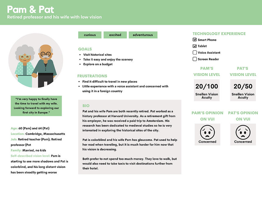
Since “low vision users” is such a broad target audience, we decided to create a second persona featuring Pam and Pat, who both have worsening vision.
User Journey Map
Since none of us have low vision, but wanted to further empathize with our users, we made a journey map to discover possible opportunities we could include in our voice system that would solve potential problems. This helped us come up with features that we would later include in our design.

Use Case Diagram
Due to time constraints, I knew my team would not be able to include a solution to every possible problem in our design, so I put together some key scenarios to see where we should focus our efforts; we were able to get to most of them in some regard.

USER FLOWS
Our user flows followed the journey of Catrina as she navigated through Amsterdam. They consisted of 12 steps (I created steps 1-6), each of which can be broken down into 4 main categories:

Planning
Find Attractions
Get More Info
Book Tickets

Transportation
Find Transport Options
Get Directions
Pre-book Transportation

Exploring
Find Nearby Amenities
Get Instant Information
Camera Identification

Sharing
Help Take photos
Write Captions
Share to Social Media
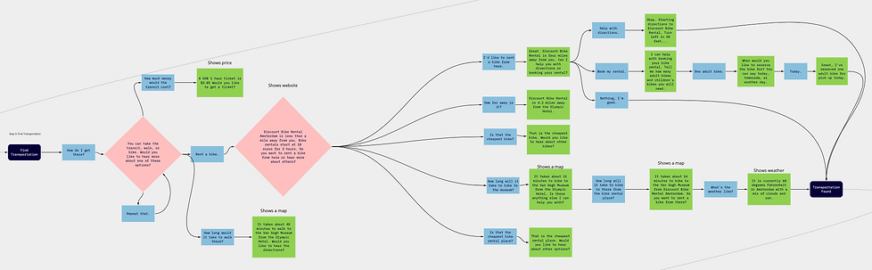
Below is an example of one of our user flows for step 3: Finding Transportation. To keep it simple, we stuck to the “happy path” and then expanded more during voice development. Careful attention was payed to wording especially since we were designing a voice-first information system. Black boxes signify user intents, blue boxes are for user utterances, green is for system utterances, and the pink diamonds are decision points. Take a closer look and see our 11 other user flows here!
VOICE DEVELOPMENT
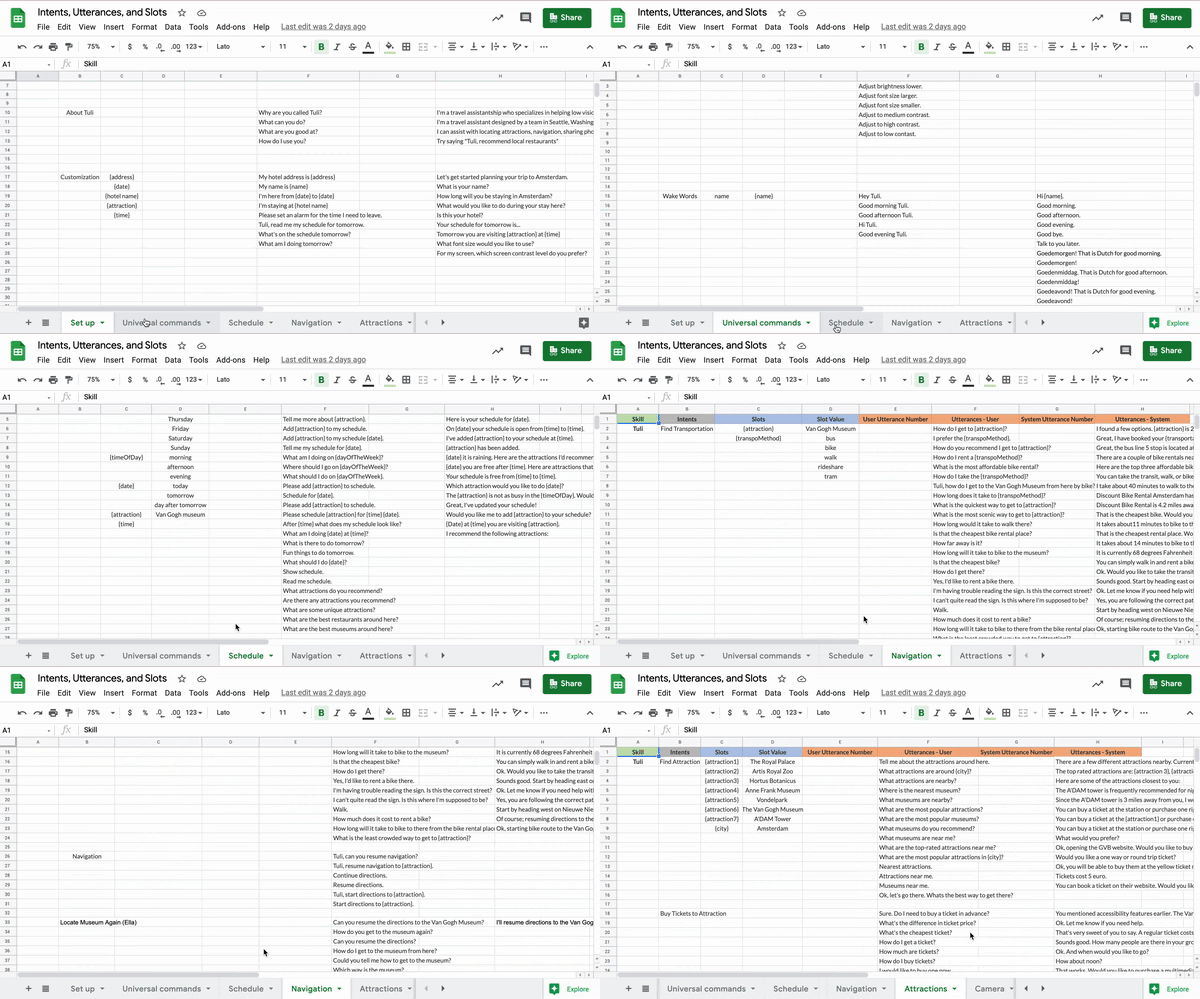
Here’s a summary of the intents, utterances, and slots we used in the voice development of Tuli. This document was used as a guideline for what we put into Voiceflow, but our actual inputs would vary some if we, say, thought of a better way to phrase something. I did step 1 (finding attractions), step 2 (locating nearby restroom), step 7 (resuming directions), error handling, and worked on some of the additional features as well. Check out our full document here!
VOICEFLOW
Building out our design in Voiceflow allowed us to consolidate everything we had worked on thus far and allowed us to test the system in order to find areas of improvement (I added our largest step: step 1). We each went through the prototype and discussed and edited parts that needed improvement, such as better system phrasing or common user utterances that were not originally included. APIs like finding attraction reviews through Yelp or getting directions through Google Maps were added to allow users to find answers by simply asking Tuli. A more detailed look into our tech specs can be seen in our technical documentation here! You can email me if you want to see the full Voiceflow prototype!


To make sure that the colors we used would be easily readable to users, even those with low vision, we used a contrast checker. The colors and fonts were chosen specifically to fit Tuli’s friendly personality.
Since Tuli is a voice-first information system, we kept the interface clean and simple to reduce ambiguity and make it easy to use, especially since many users will be using this in busy and confusing situations while navigating new places.

SELECTED SCREEN MOCKUPS
Our text-based format provides a multimodal interface in which people can also see a written form of system responses. The microphone is placed front and center to make it quick to access and the chat can be used by simply swiping up.
FEATURE 1
Voice Branding
Our voice assistant is equipped with haptic feedback and earcons (for clear confirmation/failure signals, even to those who have low-vision), in addition to Speech Synthesis Markup Language (to improve prosody). Ideally, Tuli would have a Dutch accent to fit Amsterdam, but since we didn’t have access to this voice, we chose the most similar sounding, which was British. Based on our research, we determined that most of our users would likely prefer a female voice, and thus, Tuli’s persona was born. She is polite and helpful to make skeptical users feel more comfortable, but is not boring or repetitive in order to encourage sustained use.
FEATURE 2
Customization
To increase accessibility, as well as personalization and enjoyment, we included plenty of customization options. Users can alternate between using voice or not, add events to their calendar, and even have the ability to adjust text size, color contrast, brightness levels, and speech rate.
FEATURE 3
Object Recognition
A built-in camera helps users decipher street signs, menus, artwork descriptions, and other text that they may otherwise have trouble reading. This camera also allows people to easily take pictures of themselves (through the word “capture”) and share to social media. Finally, this feature makes it convenient for users to quickly gain information on objects that they come across in their travels, such as paintings and statues.


FEEDBACK
Excellent avatar! [..] User Research work was very smart.
~ Professor
Their screens are beautiful! I love the clear sense of brand.
~ Teaching Assistant
Business summary and references were outstanding. Quality work throughout the paper. Intents, Utterances, Slots spreadsheet was outstanding. Complete coverage of what was needed, plus much more. I will use this as the example for other students to follow in the future.
~ Professor
NEXT STEPS
If we had more time to spend working on this project, we would like to conduct expanded user research (e.g. extensive usability testing), complete further development on Voiceflow (e.g. add options to access correction blocks to every part of the system), and implement more features (e.g. more attractions and transportation options). See a more in-depth look at this in the Future Work section of our Business Summary here!
REFLECTION
This was my first time doing voice design and I was surprised at how different working with VUI is then GUI. Screen designs were just one aspect of this overall product as we also needed to create substantial user flows and a vocabulary for the voice system. Additionally, I learned a new prototyping tool for this project (Voiceflow) and that had its own set of challenges, particularly with how slow the software was and its tendency to delete our work.
While we needed a lot more time than expected to put our designs into Voiceflow and edit the project, thankfully we had planned ahead for those potential setbacks at the beginning of the quarter and were able to successfully complete the project by the deadline, and even had time to do some informal usability testing.
Completing multiple iterations was essential for this project; I originally thought that our user flows and vocabulary may end up being too extensive, and while we didn’t have time to implement absolutely everything, the work that we did helped significantly reduce the time taken to actually implement it since we had already done most of the thinking and simply had to edit it, which made our project both quicker and better in the long run.