Acerca de
OVERVIEW
Walmart is one of the largest department store chains in the United States and has gained a significant online presence over the years, transforming it into an e-commerce giant. The number of people who shop on Walmart’s website has been increasing significantly since the COVID-19 outbreak with many business owners choosing to shop online now rather than go to the local retail stores. However, we found that Walmart's website has several navigation issues that could potentially cause confusion and difficulty when users are trying to find products, especially for those who were not thought of in the original design.
Duration
October - December 2020 (class project)
My Role
Information Architect
Key Skills
Website redesign, information architecture, inclusive design, competitive analysis, personas, sitemaps, wireframes
Tools
Figma, Lucidchart

Walmart for Business
Crafting a more inclusive and intuitive online shopping experience for business owners.
DESIGN OBJECTIVE
Restructure the Walmart for Business website to create a more inclusive and intuitive online shopping experience for business owners in America, with a focus on the information architecture.
CLIENT RESEARCH
My 4 team members and I began by researching our client, Walmart for Business, and getting an overview of their current information environment (i.e. their typical content, current approach to information architecture, typical users, and supported tasks) in order to see what we were working with. This information can be found at the beginning of our strategy document here!
Strengths & Weaknesses
After our initial research, we examined Walmart’s current website (we chose to focus on just their website for the scope of this project) to find out what they did well and what they could work on in terms of information architecture and inclusivity.
01
Strong sense of brand.
STRENGTHS:
02
Clean user interface.
03
Multiple navigation methods.
04
Detailed product pages.
01
Confusing and overcomplicated layout.
02
Unclear and inconsistent organization.
03
Highly technical labels used often.
04
Small text sizes and poor contrast.
WEAKNESSES:
Competitive Analysis
To further our understanding of large companies catering to businesses through websites, we did a competitive analysis on Costco and Amazon. This brought up 3 main issues with Walmart’s website:
01
Lack of text labels in their menu bar, requiring users to hunt through their extensive hamburger menu (unlike Amazon).
02
No direct link to their business website from the home page, making users go through several confusing clicks to find this page (unlike Costco).
03
Unclear hierarchical organization structure, causing difficulty when searching for something.
Interview/User Test
To get a more in-depth and personal perspective on the Walmart for Business website from someone who might use it, I reached out to a business owner I knew. Due to time constraints, I decided to combine a user test with an interview to gain as much information as quickly as possible. Through this, I gained a much better understanding of the issues currently present (confusing navigation, unclear labels, continuous scrolling, etc.).
Personas
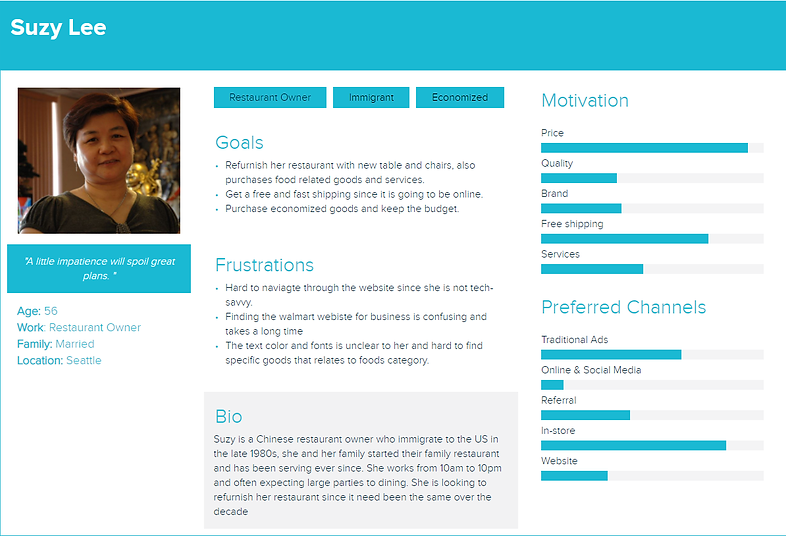
From our research, we were able to create 2 informed personas. Our persona Suzy proved especially useful to refer back to when making design decisions about inclusion (e.g. Suzy’s first language isn’t English, so we paid special attention to having clear wording).

INFORMATION ARCHITECTURE
Organization System
To make the organization more clear, we suggested employing an alphabetical organization scheme for their categories, so it’s easier for users to find what they’re looking for. Since some of the categories are hidden under unintuitive subcategories, we also recommended increasing the breadth of their category labels some.
Labeling System
The current labeling system was inconsistent with its frequent use of switching between icons and/or text labels, so we decided to stick to mainly just text to reduce possible ambiguity and inconsistency.
Navigation System
The main problems with the current navigation system are that there isn’t an adequate “Where am I?” function (so we suggest adding clear breadcrumbs), the hamburger menu is filled with so much information that it’s overwhelming (so we suggest prioritizing and shortening the list), and there are several repeated categories within the Walmart of Business site and product pages that complicate the user experience (so we suggest only keeping the relevant ones and eliminating anything unnecessary).
Search System
Their search system at the moment returns an overwhelming amount of items (e.g. searching “HP printer” produces 727 results) and presents these results in an inconsistent way (such as changing the number of results on each page displayed). As such, we’d recommend displaying products consistently and creating a search system specifically for Walmart for Business that would help narrow the results to more for what users are looking for.
Controlled Vocabulary
I took the lead on this section and found that Walmart currently combines a hierarchical taxonomy with a faceted taxonomy by using a hierarchy to organize their facets. To avoid confusing the user, we recommended that the company switch to simply using a hierarchical taxonomy in order to increase consistency while making it easier for users to find what they are looking for.
Additionally, their current search system uses high recall, which may suit some users, but based on our personas (who want to be able to find what they are looking for quickly) as well as with the business owner we interviewed (who found it difficult to sort through the vast amount of items currently included in most searches), we thought it would benefit more users to use an approach more focused on high precision. Here are two examples of possible synonym rings that Walmart could use to follow that:


SITEMAPS
Here is the sitemap that Walmart currently uses:

The orange line shows the extensive path users must follow to access the business page. To make this more simple, we streamlined this path by adding a business link to the homepage (similar to what Costco does). In addition to updating the categories to make them more clear, we also added a wizard for personalization. See Walmart’s sitemap with our improvements below:

WIREFRAMES
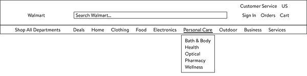
To visualize our previously mentioned recommendations, we created wireframes of the Walmart for Business website. This included the main page, menu bars, and a draft of a wizard that would be used to help customize the website to better fit each individual business owner’s needs.
Walmart Menu
Walmart for Business Menu

Walmart for Business Page

Walmart for Business Wizard

PROTOTYPE
Our prototype was closer to a high-fidelity interactive wireframe as the focus was more on the information architecture for this project. We decided to keep Walmart's current style guide, but updated the layout and organization to demonstrate our suggestions for improving the user experience (e.g. adding links to important pages in the menu bar, eliminating unnecessary icons, creating a place to change the language, building a back to top button, restructuring the reviews alignment, implementing a compare products feature, reducing repetition, etc.).
Walmart Menu

Walmart for Business Menu/Page

Walmart for Business Wizard

Walmart for Business Product Page

REFLECTION
Since this was for an information architecture class, this project was unique because I was focusing on one specific aspect of UX instead of encompassing all stages. I really had a chance to take a deep dive into how information architects work and also see where IA overlaps with the rest of UX and where it’s different. I found some parts to be similar, such as the initial research (which was admittedly difficult since we were designing for a more specific, hard-to-reach user group), but the focus for IA was almost entirely on how content was organized and displayed. Gaining this in-depth experience helped me in my later projects as I was able to understand more of what was going on “behind the scenes” and thus create better overall interfaces.